Wednesday, May 20, 2009

Week 8 Blog Applications Exercise_Graphic Design


Shape

This is a poster designed by Paul Rand for IBM computers. Paul Rand uses shape so effectively in this poster. The shapes are very basic in form but are used effectively to illustrate a logo and brand. The shapes he uses to illustrate a bee are very simple and geometric yet they completely embody an insect that is very visually complex in real life.


Movement

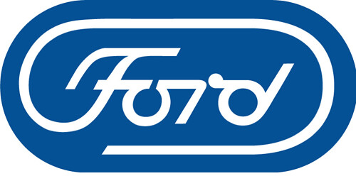
This ford logo contains allot of movement. It is not mistake that this logo contains allot of movement because Ford is a car company and cars...dun dun duh.. MOVE. The F in Ford is so fluid and active. The fact that the three last letters are connected together makes the logo so much more fluid.


Scale

This is a poster that uses scale to be effective. The letters are so big that they make the people in the poster look like ants. Scale is important in this poster because it shifts the readers focus to the text, which is the most important part.

Week 6 Aplications Blog_Syntactical Guidlines


This poster illustrates poor use of the syntactical guidelines. Nothing in this poster is well defined and everything seems to be hiding in the fog. Also, the text at the bottom of the poster is white. This is a huge problem because everything else in the poster is pretty much white. The text is both unnoticeable and unreadable.


This poster for the movie pulp fiction makes good use of the syntactical guidelines. It is similar to the previous poster, in the way that it has the cast of characters from the movie in it, except that it is much more dramatic and legible. The way that the actors are arranged creates tension and puts the focus on Uma Thurmans character. The title of the film is very legible and the supporting text is carefully placed on the bright spot on the wall, making it extremely easy to read.

Wednesday, May 13, 2009

Week 14 Application


This is a ford logo that paul reand designed. It is representational because it uses type to exude a feeling and style. Also the type can be interpreted as a car. This logo is representational of speed and style. PAUL RAND has communicated fords marketing devices with out having a tag line that says "ford is trying to be fast and stylish."


This is a picasso painting that is abstract. Picasso uses geometric shapes to resemble persons and things. Also he uses low contrasting colors to create a scenario. The art is very far from realistic making it very abstract.


This image is symbolizes the act of drafting. These are some of the tools used when drafting. To some people this image means nothing, but to someone who drafts or has drafts they will associate this image with the act of drafting.